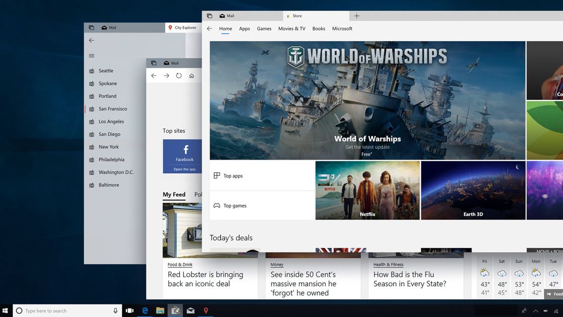
The company took the time to outline what’s coming to Fluent Design in 2018, as well as additions in the Windows 10 April 2018 update. Many of the changes are subtle, but will spur a gradual shift over the next couple of years. They also look to make Fluent Design more consistent. The addition of shadow effects, modern context menus, and navigation views should make Windows 10 more intuitive to use. However, each element is there for a reason. Shadow effects, for example, add a feeling of depth to the OS, which can add more clarity. It will also become more important as virtual and augmented reality grows, making use of 3D capabilities.
Compact Modes and Flyout Menus
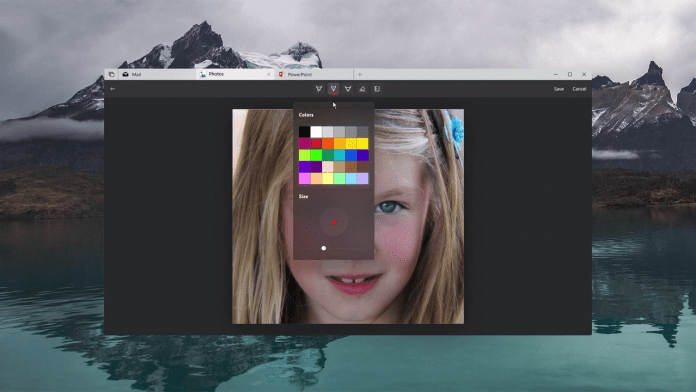
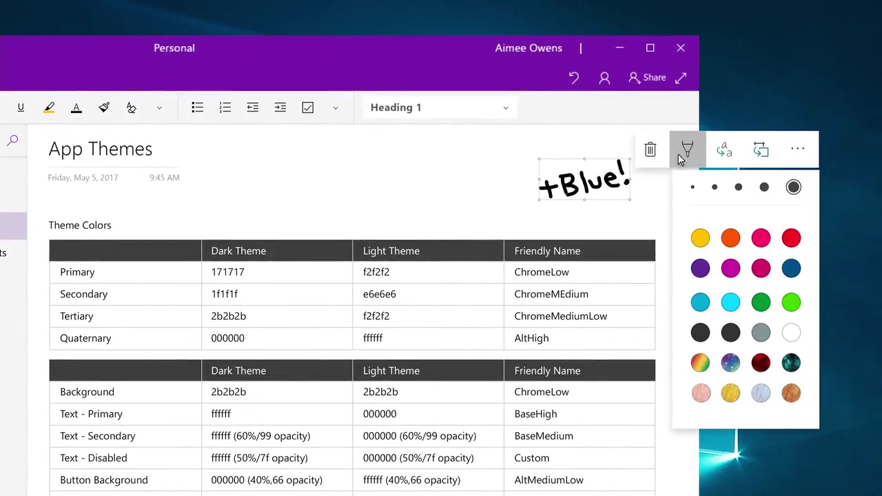
Another advantage of the slow design rollout is Microsoft’s ability to act on feedback. Many have voiced their concern about the size of UI elements in Fluent Design, which is suitable for tablets, but too large in a desktop environment. The Redmond giant is planning to add smaller controls, as well as a compact mode that will focus on productivity. Another aid to productivity will come in the form of inline flyout menus. Essentially, these will display the tools you need where you’re working, rather than in a dedicated space at the top or side of the screen.
Also coming this year is form validation, @mentions, contextual commanding, reveal focus, spatial sound, and more acrtylic material elements. The additions are a big step up, with over fourteen elements versus last year’s five. The full presentation should be labelled Design: Evolving our Design System, and will be on the Build website soon.


