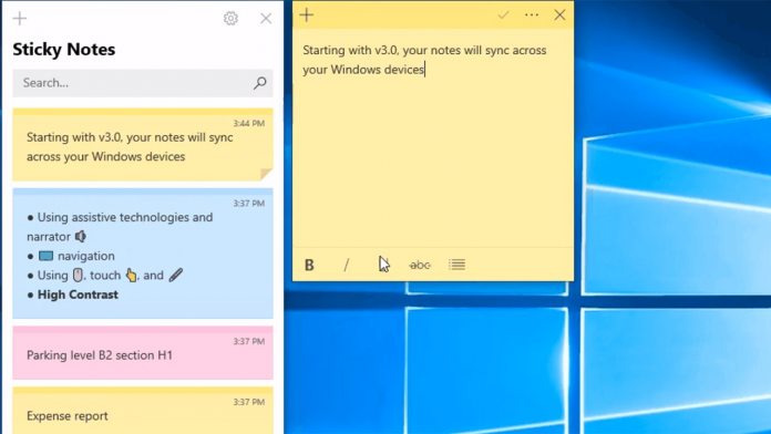
However, one of the most drastic improvements is performance. Users should note that Sticky Notes 3.0 starts faster and responds more quickly. This makes it much more useful if you need to write something down in a pinch, and comes with added stability. In terms of design, the difference isn’t huge, but Fluent Design elements have begun to creep their way in. This is particularly noticeable in the app’s new home, which lets you choose which notes to display and which to hide. Once you’ve completed a task, you’re now able to cross them out rather than deleting them. This gives a visual indicator of a person’s progress and can feel a lot more satisfying. Users can also style their notes generally with a new formatting bar.
A Staggered Rollout
Finally, Microsoft is making Sticky Notes more accessible, though it doesn’t mention specifics. It simply hails ‘drastic improvements’. Unfortunately, while the update is live on the April 2018 update, it doesn’t seem to be available to everyone. The new version is coming to different users over the course of a few days, so some patience is required. In all, it’s a dramatic improvement for the app, and one that may draw in new users. Microsoft is planning to introduce mobile versions of Sticky Notes in the future, when it’s sync support will make it even more powerful.


