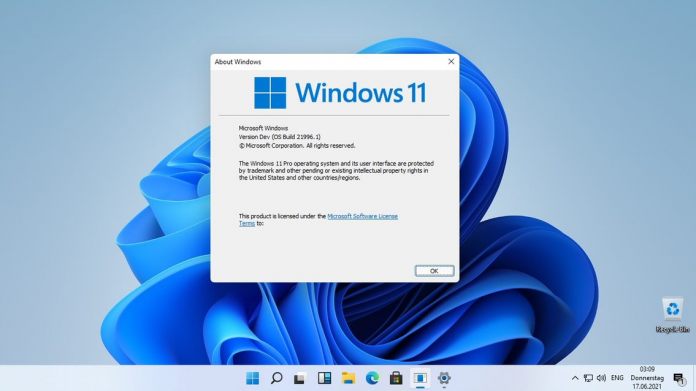
Ahead of Microsoft’s “What’s Next for Windows” event on June 24, we now already know about much of what is next. We have been playing around with the leaked Windows 11 ISO build for the last days and below is what we have found out. Here are the changes we are most excited about in Windows 11.
Rounded Windows and New Icons
With Windows 10, Microsoft took a professional approach to UI, largely in an attempt to exorcize the memories of the Metro UI on Windows 8. That meant sharp corners and a lot of flat edges. As design tastes evolve, Microsoft is changing how the platform will look with Windows 11.
We are not getting the drastic shift we got from Windows 8 to 10, but we do see the corners become rounder. It seems like a minor change on paper, but surprisingly it completely transforms how Windows looks. The new look is enhanced further by new icons. Microsoft has often been slow to the party in terms of icons. On Windows 10, we had icon design remnants from Windows 8 and Windows 7. We have already seen how Fluent Design has influenced new icons for Office apps. In Windows 11, Microsoft will extend those new icons to other apps.
Start Menu and Search
Another visual change in Windows 11 is Microsoft taking ideas from the doomed Windows 10X and bringing them to the new platform. This is evident in the central location of the Start Menu and Taskbar. We will cover the task bar in the next section, so let’s start with the Start Menu. Instead of opening on the left of the screen as it always has (Since Windows 95), the Start Menu now opens centrally. What this does is brings a major UI change to Windows. I think this will be a controversial change because the Start Menu opening on the left is arguably more efficient.
Still, this change looks amazing at least, and the good news is users can still choose to move it to the left. Microsoft is also ditching its Live Tiles, an idea that was always cooler in concept than it was in practice.
In the Windows 11 Start Menu, you can see pinned apps alongside recent files. All-in-all, it is a minimal design that looks slick. As for Search, there is now a new icon that when pressed brings up a search bar that floats.
Taskbar and Action Center
Carrying on with the centralizing look brought from Windows 10, taskbar icons are now also located centrally. This is a nice change on a personal level because off-center icons have always somewhat annoyed me. On Windows 11, icons sit square in the center of the task bar.
One of the items on the task bar is the Action Center, which is also getting a visual overhaul. It too gets the rounded corners of the overall UI, which slider buttons are larger.
Multitasking with Fancy Zones
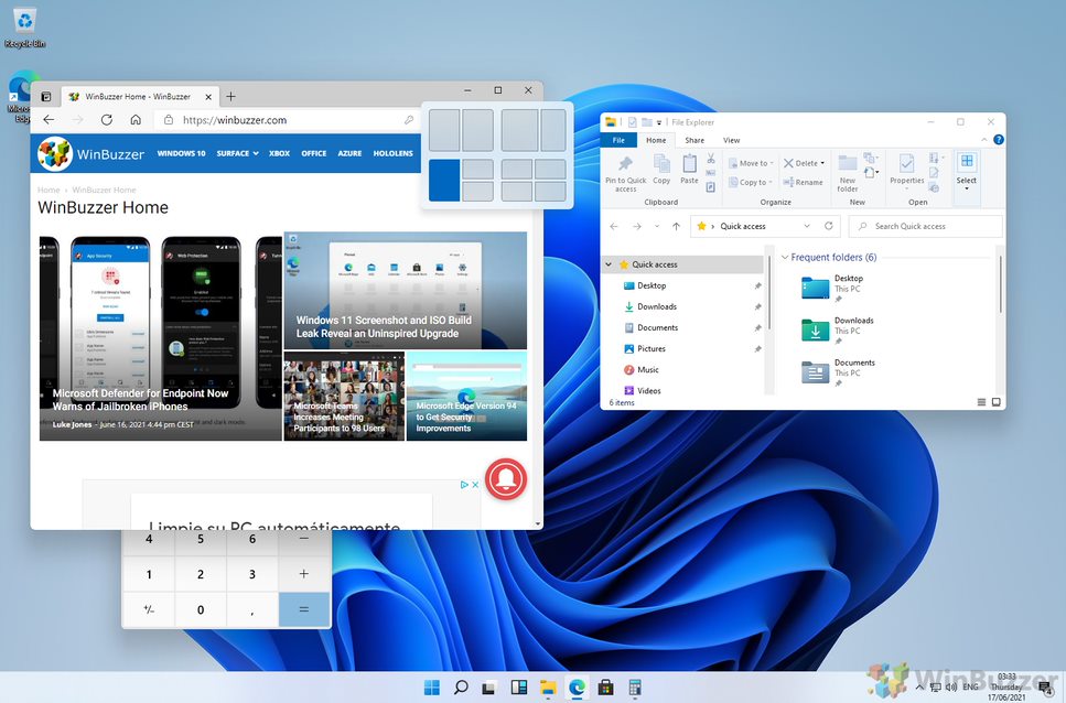
Windows 10 was always solid for multi-tasking, allowing users to use split screen modes to see multiple apps and files. Windows 11 will evolve the multi-tasking capabilities with what is essentially a groups feature.
When you hover over the maximize button on a window, there are now six ways to connect it with other active windows. You can create a group of windows that the Windows 11 platform will remember for the future. Microsoft is leveraging its Fancy Zones tool for this change, which is part of the Power Toys platform. It allows you to create windows tiles and have customer layouts. This is now integrated into Windows 11, making this the most dynamic multi-tasking version of Windows yet.
The Task View can show all open windows and now looks cleaner and more welcoming than on Windows 10.
System Sounds
Sounds are another area where Microsoft has made few improvements for years. Windows 10 didn’t make much progress and retained many of the sounds Microsoft was using in Windows 8 and before.
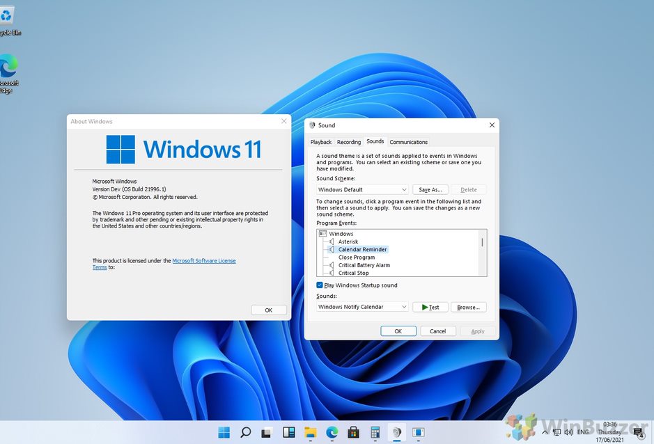
Windows 11 is finally introducing a new soundscape for the platform. Sure, this is a minor touch, but still a welcome one. There are now different sounds covering multiple tasks on Windows 11, such as error messages, notifications, USB connections, and more.
Widgets
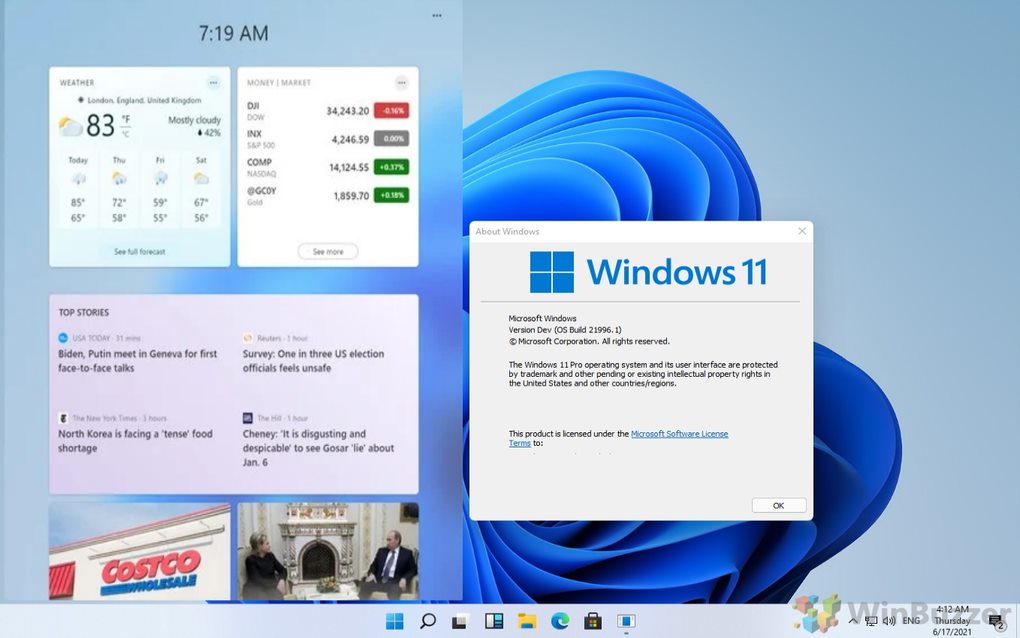
Widgets are once again part of the Windows experience for the first time since Windows Vista. Accessible through the taskbar, a new UI for the widgets shows different items across tiles. We have already seen Microsoft start this process on Windows 10 with the News and weather taskbar widget.
In Windows 11, we expect to see the company flesh out the number of available widgets. Hopefully, this also includes allowing third-party developers to build their own widgets. Like other areas of Windows 11, the widgets are a clear sign that this is a Windows generation tarting consumers from launch. It is all about design and customization and adding functionality to the desktop experience. Tip of the day: Did you know that as a Windows 10 admin you can restrict user accounts by disabling settings or the control panel? Our tutorial shows how to disable and enable them via Group Policy and the registry.
![]()


